Recently Williston Northampton announced an evolution in institutional iconography, with the introduction of a new “shield” logo and a redesign – not an abandonment – of the extant and, as shall be seen, hardly ancient “tree and mountain” seal. Predictably, the school received many reactions, that ranged from enthusiasm to apoplexy. It may be instructive to look at school branding – for that it what we are talking about, a brand, a recognizable visual and textual representation of something far larger and more complex – through 171 years of history.
In the beginning . . .
. . . Samuel created the Seminary. And he looked upon the Seminary, and saw that it was good. So Samuel caused an image of the campus to be imprinted upon the stationery . . . and gave the matter no further thought.
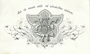
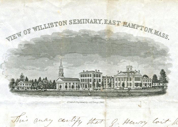 Meanwhile the students sought to decorate their publications and accessories with often ornate imagery that reflected contemporary taste. There remained, however, no standard seal or logo.
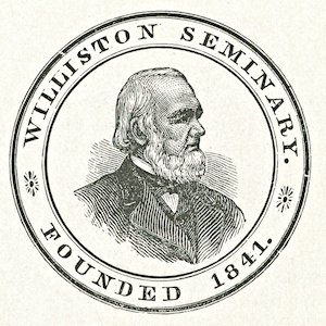 Sometime in the mid-1880s a wood-engraved seal representing a rather rustic Samuel Williston made its appearance in a few student publications. The earliest appearance is in a senior yearbook, The Williston Bus, in 1886. It does not appear to have been widely adopted; no examples of its use on letterhead, or in official publications such as the Annual Catalogue, have come to hand. It is doubtful that Samuel Williston, despite having sat for several painted and photographic portraits, would have approved of such a “graven image,” nor is Emily Williston likely to have been comfortable with it. Thus the advent of this seal may well follow Emily’s death in 1885.
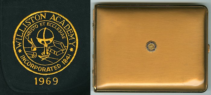
 During the tenure of Principal William Gallagher (who served 1886-1896) a seal was introduced that would remain in use for eight decades. It made its first appearance in the Annual Catalogue of 1892. The device comprised a circular shield with the school’s name and date of founding surrounding the attributes of academia: a globe, compass or calipers, quills, scroll, and books, with the motto “Christo et Ecclesiae” (Christ and Church). The origins of the motto remain unclear, since despite our “Seminary” name and the Calvinist convictions of the founder, we were always at least nominally a secular school. (Please read “The Center of All Days” for more information.) It is also arguable that the central position of the globe evoked the school’s international character, an important part of school life then as now.
 By the mid-20th century there had evolved two renderings of the seal: a more detailed version suitable for print or large display, and a simplified version that could be stamped or embroidered on clothing.
Over the years this seal would also be applied to neckties, notebooks, jewelry, and a variety of accessories such as cigarette cases and lighters, belt buckles, glassware, even pants hangers.
Northampton School for Girls
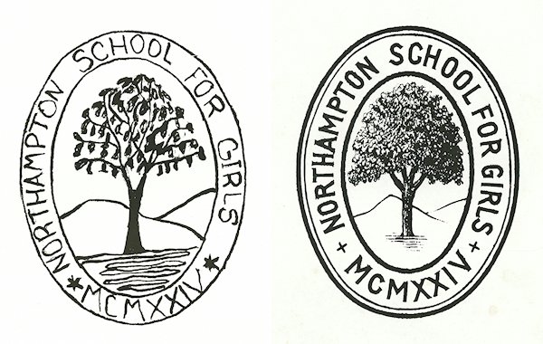
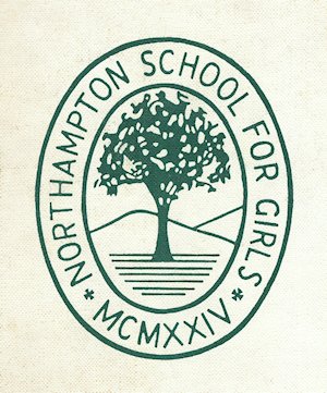 Northampton School employed one seal, a lozenge illustrated with a tree, presumably an elm. (See “A Note on the Elm Tree Tradition, below.) The earliest appearance of the device is in a 1941 yearbook. There it is hand-drawn; it is probable that the hand rendering preceded any engraved version. In fact, the only remaining example of an engraved Northampton seal is on commercial stationery from the 1950s and 1960s.
Students appeared to take more of an interest in the seal than did Principals Sarah Whitaker and Dorothy Bement. There is evidence suggesting that the seal never really acquired “official” status. While freehand versions, some of them relatively crude, appear in yearbooks and the campus newspaper Pegasus throughout the 1940s-1960s, at no point did the Principals use it on school letterhead, nor did it appear in the Catalogue until the late 1960s, even then only in a hand rendering.
The Williston Northampton School
It may surprise those seeking a long-term tradition that from 1971, when Northampton School for Girls merged with Williston Academy, until 1982, Williston Northampton employed no school seal at all. Only The Willistonian, in a gesture toward the past, ran both old logos on either side of the title. Even this ceased in 1973.

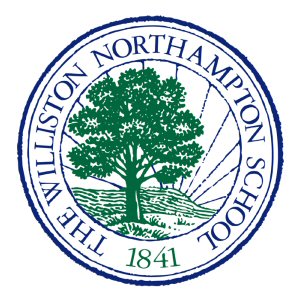
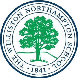
In 1982 a marketing team introduced a logo comprising a tree, presumably but not definitively an elm, in front of Mount Tom. This image has evolved through several re-designs over the last four decades. There have been attempts to impose symbolic import upon the design. Some of these have bordered on absurdity. This writer himself regrets having written some unmitigated nonsense about “deep roots” in a Bulletin piece just a year ago. And no, it was never meant to be the “tree of knowledge.” Sometimes a tree is just a tree.
What’s in a Name?
“Mr. Williston is not the teacher. He has nothing to do with it, no more than you have. He is the founder of it — therefore it is called the Williston Seminary.” Student Abner Austin, in a letter to his friend Cassie, December 1856.
Cassie was not the first to need enlightenment. The school’s name itself has changed several times. The word “Seminary,” applied to a secondary school, was archaic in 1841 when we opened our doors. The modern connotation, “school of religious instruction” was already widespread. Despite Samuel Williston’s strong religious sentiments, “Sem” was a secular institution. Girls’ schools were also called Seminaries. Having ended coeducation in 1864, Williston was not that kind of seminary, either. This detail appears, in part, to have driven the school’s change of name in 1924, after a student was denied Harvard admission because “she” failed to meet the most fundamental requirement for eligibility. We became Williston Academy, immediately creating an opportunity for confusion with another school by the same name (1828-1950) in Williston, Vermont.
In that same year, Dorothy Bement and Sarah Whitaker founded The Northampton Preparatory School, Inc. This lead-footed name reflected the corporate nature of the school’s financing; Whitaker and Bement had initially intended a for-profit institution owned by its stockholders. Happily, they were dissuaded from calling it anything other than The Northampton School for Girls. When ‘Hamp, as its students mostly called it, merged with Williston in 1971, the intended name was “Williston Academy and Northampton School for Girls.” For about a year, this return to lead-footedness appeared on letterhead and publications, before clearer heads realized that ‘Hamp’s name could be kept alive in a more concise “The Williston-Northampton School.” Several years later, according to legend, the hyphen was dropped after a misplaced and ill-received jest suggesting the hyphen was a minus sign.
So we are The Williston Northampton School, capital T, no hyphen. Our internal style sheet urges the use of the full name at the beginning of all institutional communications, after which concision and commonsense take hold. Contrary to occasional assertions, there is no legal requirement to use any particular name at all. And 41 years into coeducation, it is clear that Hamp’s legacy is essential to every aspect of Williston Northampton culture, no matter what label we put on it.
School Colors
Williston Seminary’s/Academy’s colors were blue and gold. At what point they were officially adopted has not been pinned down, but the tradition may go back well into the 19th century. There are references in songbooks dated 1904 to “the gold and blue,” and a number of student publications adopted that color scheme for their covers. Athletic medals from the previous decade sport blue and gold ribbons. Northampton School for Girls used green and white. School blazers were forest green with white trim, and were typically worn with white pleated skirts. For intramural athletic and social competition, all students were assigned to either the “green team” or the “white team.”
At the time of the merger, a decision was made to adopt one color from each school; thus, since 1971 Williston Northampton’s official colors have been green and blue.
A Note on the Elm Tree Tradition
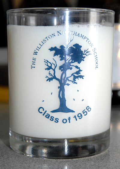
During his years as a student, Paul “Pitt” Johnson, class of 1905, was asked by his friends to write a “stand-up song.” He lifted a tune from “Trial by Jury” and penned two stanzas of doggerel, which survive today as our song “Sammy.” No reference to elm trees can be found in school literature prior to Johnson’s creation of the line “And your old elm tree,” which apparently resulted from his inability to come up with a better rhyme for “My heart yearns for thee.” While older alumni recall an ancient elm that stood in front of North Hall, the reality was that prior to the onset of the Dutch Elm blight, there were such monumental trees on every street in Easthampton. There is absolutely no evidence that Williston ever took an interest in trees.
Northampton School for Girls had an elm of spiritual significance on the “Sacred Lawn” between Montgomery and Hathaway Houses. At Commencement the class would encircle it and sing the alma mater. At various stages in school history, senior yearbooks were titled ‘Neath the Elm and L’Ormeau. The tree blew down in a storm in 1956. Photographic evidence indicates that at subsequent Commencements, the seniors surrounded a maple.
From these dubious roots Williston Northampton maintains not only the image on one of its two present school seals, but a donor society and a mysterious line – “Elm tree’s watchful gaze is true” – in an otherwise lucid alma mater.
The reality is that everything evolves, from schools themselves to trends in publication design, institutional marketing, and the expectations of a large and diverse community. Though students and alumni of different generations always take ownership of what they perceive to be “Tradition,” that, too, is a mutable commodity. Throughout evolutions of seals and songs, or of far more important concerns like campus and curriculum, Williston Northampton remains a great school. The many attributes of that greatness are perhaps summarized in our mission statement, with the words “Purpose, Passion, and Integrity.” Those ideals are a constant. All else may change with the times.


Thank you for the enlightening and clarifying information; history, indeed, has its place, and yet we interpret it through our individual lenses. “Sammy,” with its elm tree reference, has been revived and serves as unifying song for a variety of occasions; symbols change but the institution remains.
Thanks Rick. Interesting article. Came here from Lansing Pugh’s Facebook link!
I may have some information helpful to pinning down the date that we decided on the school colors – in the first copy of The Willistonian, a writer states, “We would suggest that a committee be appointed at the next school meeting to decide on a school color, then submit their choice to be sanctioned and adopted by the whole school as the Williston color.”
At least in 1881, the school lacked a color and wanted one. Hope this is useful!
Good eye, Brendan! Why not come downstairs to the Archives and look in the next few issues to see if you can get a definitive answer?
Three words, I HATE IT!!!