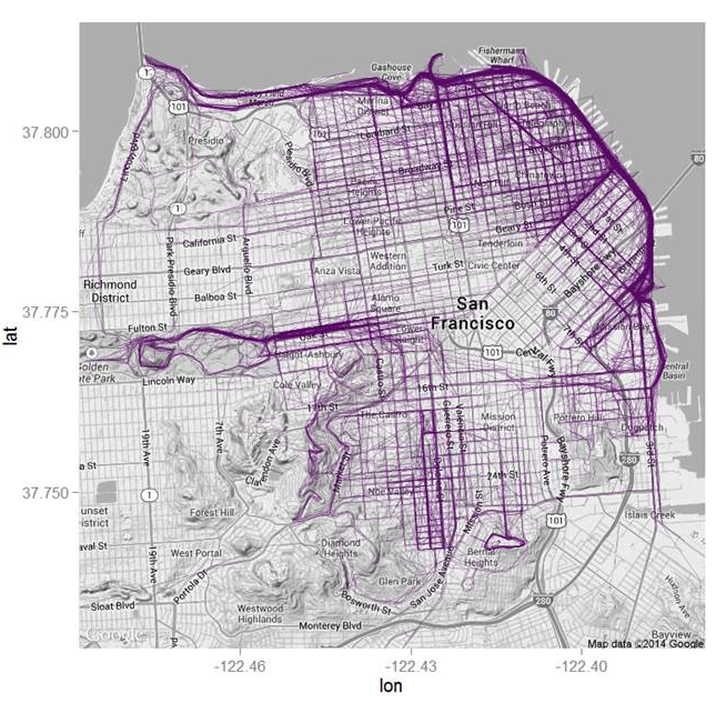
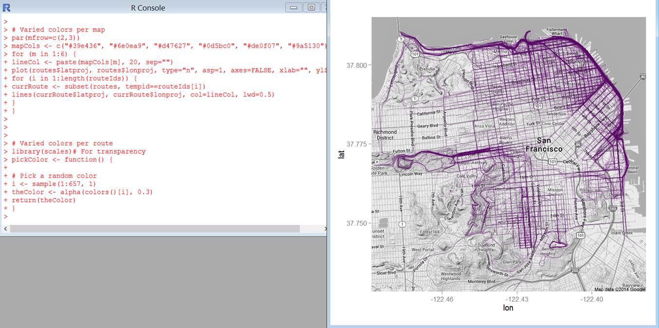
Check out this awesome message and visualization created by Mrs. Baldwin!
“R is arguably the most powerful statistical analysis tool out there. Its features extend far into the world of data visualization. After the AP Statistics exam, students will have the opportunity to learn and develop their skills in the R environment creating graphics such as this. The graphic overlays data from RunKeeper onto a map of San Francisco. This visualization shows the most frequently travelled routes for runners in the city!
Inspiration and script from flowingdata.com.”


