Juniors in the AP Statistics class had the opportunity, this year, to work on a project in the style of a statistical consultant. Students used real data from the 50 States and had their choice of variables to examine. Many of the projects looked at patterns and relationships among various social indicators such as crime, income, education, etc. We looked for trends and associations using a sophisticated statistical programming language called “R”. This was an ambitious task, but the students jumped right in and turned in some of their finest work! Please enjoy the following excerpts from their work.
Ty Lee – Education trends in the 50 States
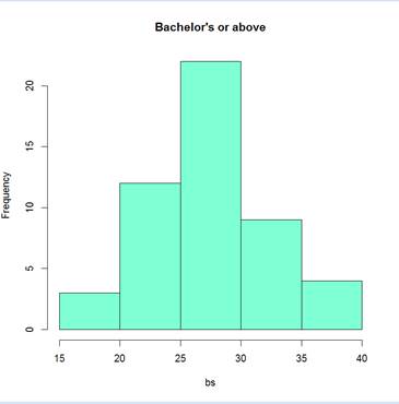
This histogram visualizes the distribution of the percent of the state population with a bachelor’s degree or higher. Height of boxes indicate the number of states that fall into the range from the left end to the right end. The state with lowest rate was West Virginia, while the highest was District of Columbia. The shape of this histogram seems to indicate that the underlying population is normal; the graph is uni-modal, not skewed, and looks similar to a bell curve.
Cade Zawacki – Statistical Analysis Casts Doubt on a Claim about Gun Violence
“If you look at all the fiascos that have occurred, 99 percent of them have been by Democrats pulling their guns out and shooting people,” Kiehne said. “So I don’t think you have a problem with the Republicans.”
Chi-Data:
(Does NOT include outliers CO + CT)
(Observed – Expected) ^2 / (Expected)
Blue: 0.2821752532
Red: 0.6195867769 +
Sum: 0.9017620301
Chi-Squared cdf(0.9017620301,e99,1) = 0.3423096854
With a Chi-Squared value of about 0.902, we can expect to see results like this about 34% of the time – assuming that mass shootings happen randomly in any state. Thus, we cannot conclude that there is a relationship between mass shootings and political affiliation.
Depicted above: Chi-Squared cdf(0.9017620301,e99,1) = 0.3423096854
(Domain 0<x<2)
[These results suggests that it is highly likely that the political inclinations of the State have no effect on the occurrence or frequency of mass shootings. This student pointed out that the data limit our conclusions, to a certain degree since we do not have data for the political preferences of individual shooters.]
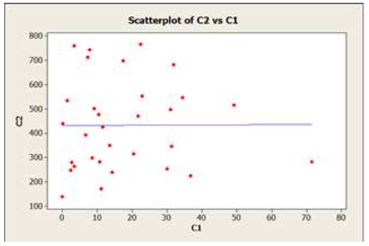
Norio Chan and Simon Lu – No Significant Difference in Assault Rates in Red and Blue States
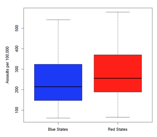
The graph and the results of the t-test show that we cannot reject the null hypothesis of “no difference in assault rates”. There is no strong evidence to suggest that assault rates are different in blue states and red states.
Gleb Paschenko – Murder Rates Decrease when High School Graduation Rates Increase
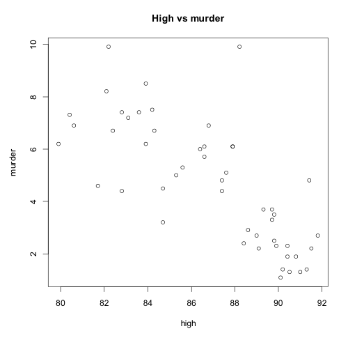
Although some outliers are present, the association seems to follow a moderately strong negative linear pattern. In states where high school graduation rate is higher, the murder rate per 100,000 is lower.
James Kim – Are Harsher Sentences Associated with Crime Reduction?
Correlation Between Strength of Sentence/Real Execution Rate and Crime Rate
The very high P-Value suggests that there probably is no relationship between the real execution rate and the murder rate. [We might be inclined to believe that those states with more severe penalties might see a reduction in crime. The data was not able to demonstrate that this was the case.]
Emma Lawrence and Sam Atkins – High School Graduation Rates in Red States and Blue State
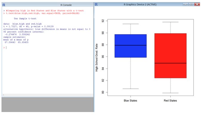
If we use a significance level of .1 then we can reject the null hypothesis of no difference in high school graduation rates due to the p-value being less than .1. There is some evidence to suggest that high school graduation rates are higher in Blue States. [They are certainly more consistent.]
Summary
In a world of uncertainty, the mind looks for deterministic explanations. Statistics students have learned to talk about uncertainty, supported by quantitative measures, with confidence. We learned that, too often, our preconceived ideas about a population or claims in the media rest on very little data, indeed. Students, you have been entrusted with a powerful tool – use it for the good of humankind!